Friday, 25 January 2013

In the Mood for Love (2000)

(http://ic.pics.livejournal.com/iulieki/5565690/297182/297182_original.jpg)

In the Mood for Love, a chinese film set in the 1960's is a beautifully shot masterpiece, with stunning costumes. I found it to be mostly heartbreaking, but wonderful at the same time. The film unfolds slowly, giving you tiny clues all the way- I was constantly trying to figure out exactly what was going on. Much like thriller/suspense films from the 40s and 50s, the film has a sense of restraint to it- the plot will never be explicitly spelled out, and therein lies the true appeal of the film. In terms of the films we've watched this week, this one definitely qualifies as the most 'artsy', but also my favourite of the bunch, even if just for the cinematography.


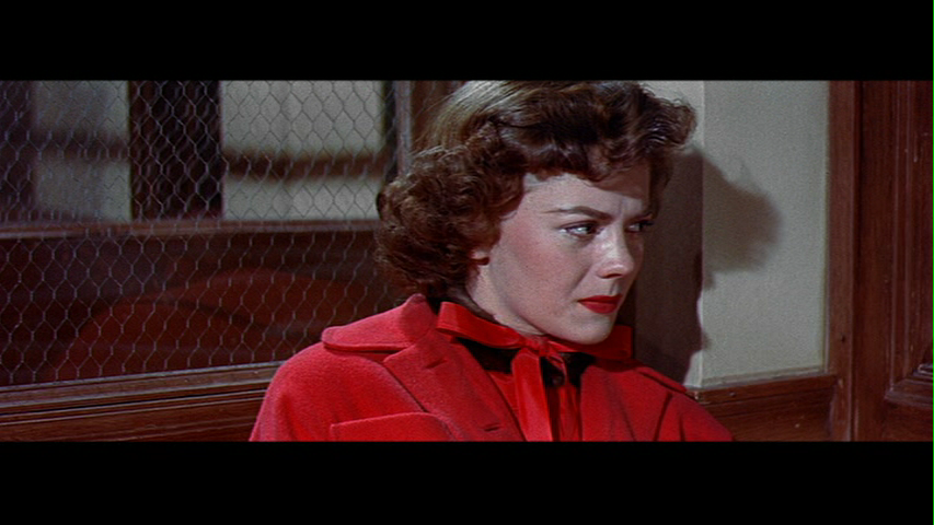
The costume designer, William Chang, created the lead female's endless cheongsams from dead stock 60's upholstery fabric, leading to a series of beautifully constructed dresses, all made from the same pattern. However, every single dress- possibly hundreds- is made from a different fabric, mainly florals, stripes and solid colours. Through these dresses we are able to get a sense of the passing of time throughout the film, as the sets never seem to change- each time we see a new dress, the audience is able to register that a day has gone by. Additionally, the lead actresses' hair and makeup stays the same throughout the duration of the movie, showcasing femme fatale style with killer cat eyeliner, and giving away aspects of her character that are mirrored through the plot: here is a woman who rarely lets anything of herself show to the outside world. Aside from the seemingly endless cheongsams, she dons a red swing coat once in the film- the only time she does so. This coat is incredibly visually powerful, as it matches the red of the set behind her, and contrasting against the bold black and white floral of her dress. This boldness helps to drive home the emotional point of the scene, and, ultimately, the film.

(http://justunderthesurface.files.wordpress.com/2011/09/in-the-mood-for-love-021.jpg)

Tuesday, 22 January 2013

Rebel Without a Cause (1955)

(http://classichollywoodcentral.com/wp-content/uploads/2012/07/james-dean-and-natalie-wood-in-rebel.jpg)

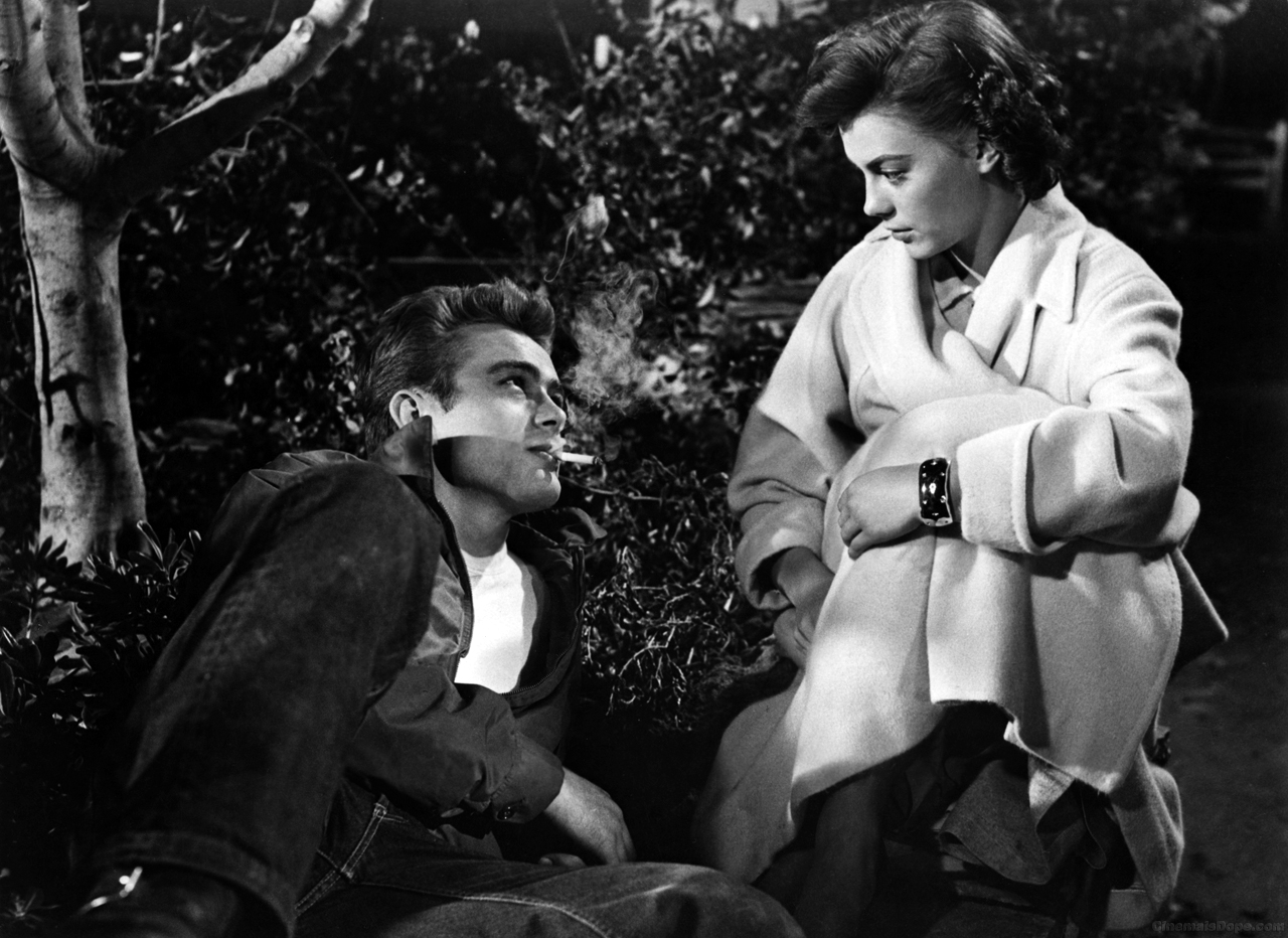
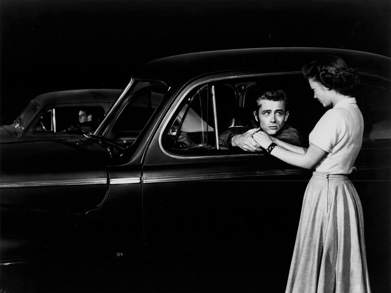
The classic teen rebellion film, Rebel Without a Cause is made all the more iconic by the stories of death that immediatley followed the film's release- almost mirroring the themes of the film itself. I'd seen parts of this film before, so I had some idea of what to expect. However, James Dean's acting took me by surprise- I found him to be a far more physical actor then i'd imagined. His wild arm movements and visible tension definitely added to his portrayal of a frustrated and mixed-up teenager, and, let's face it, his appearance helps too (one of the notes I had written down for this film read simply: phwoaaar.) Dean aside, I also loved Natalie Wood in this film, especially due to the layers within her character- she runs with the bad kids, but deep down she want's her father's approval. A running theme I noticed within the film was each character's issues with their father- Dean wanted his to be more of a man, Wood wanted hers to show affection, and Plato's father was simply absent.

(http://images4.fanpop.com/image/photos/16500000/Rebel-Without-a-Cause-james-dean-16501384-800-600.jpg)

The costuming of the film, which launched the white t-shirt and jeans look, first popularised by Marlon Brando, was fantastic, and had some great colour themes running throughout. Jimmy's red jacket, first donned as a sign of rebellion against his father, and later passed on to Plato as a symbol of manhood, could almost be compared to Holden Caufield's red hunting cap, in terms of significance towards character development. The costumes utilise the colour red frequently, as a symbol of rebellion, as well as a symbol for death. I particularly enjoyed watching Judy's costumes change as the film progressed. When we first see her, she is clad in red, and later, black and green. However, as she begins to fall for Dean, we see her shift into soft pastels- indicative of her shedding of her past associations with the bad kids.

(http://andrewsidea.files.wordpress.com/2008/06/vlcsnap-9938187.png)

Saturday, 19 January 2013

Marie Antoinette (2006)

(https://blogger.googleusercontent.com/img/b/R29vZ2xl/AVvXsEj6N4PTy_tqY-2sLhxR3vXyBlKAH9G5LxzHu10FBfHnFk-Yg-_TIgifOWo_6E_76gsOeKHW2NcrMzUkwN8CBGV_i6Gqwq36Lr2OIS0UUnS2Bbz1uwOf9Awag64nJuuFoDFqnjIU8WXxm1XH/s1600/12.jpg)

Coppola's 2006 loose portrayal of the early life of Marie Antoinette was considered rather controversial when it was first released, especially to french audiences who felt that the film was insensitive to a period of highly revolutionary history. Having never seen the film before, I wasn't surprised to find out that I wholeheartedly loved it- initially for the visual masterpiece, and later as I empathised with the titular character. However, I feel that this enjoyment of the film made me forget to step back occasionally and examine the film critically, so swept along by the plot, costumes and punchy soundtrack as I was. In retrospect, what makes the 2006 portrayal of Marie stand out is the complete lack of toning down the luxury in Versailles- in fact, the film goes to great lengths to over-emphasise this aspect. This means the film starts to exist in it's own sphere, elevated from the trappings of historical accuracy and restraint. In terms of costume and set design, this allowed for a clear aesthetic to develop, a common feature in Coppola's films.

(https://blogger.googleusercontent.com/img/b/R29vZ2xl/AVvXsEiYAlZGccVZEavOdljrLagPErXJmdwWzjHVhb6tIuU3UxMThoEaWO3g0QUdQ2R36-1nywBFMBF5ZJRyXaxd179uwHHU3o1dMyaAgpUzn1h07BTrSmLWwoOZ7IdvnP9PmVcKFKCFS1iQpOLB/s1600/marieantoniettehd38.jpg)

The costumes, while demonstrating the opulent and constrained life she lives, also serve to act as a visual reminder of Marie's gradual loss of innocence, as we see her metamorphose from a young girl into a queen and mother. Initially, as seen above, she is dressed simply, in fashions from her home court, and simple, undone hair. Upon arriving in France, she is placed into increasingly elaborate gowns, ones that fortell her forthcoming obsession with the party lifestyle- this is particularly highlighted in the 'I want candy' scene. Lastly, following the birth of her children, we see simple white gowns, designed for country life, and flower crowns- demonstrating that she has concluded her arc, in providing heirs to the throne and solving the major plot point of the film.

The film ends with the fate of Marie unsure- yet the viewer, versed in french history, knows all too well her outcome, which comes as a sobering shock, a palate cleanser to the sheer spectacle of visual decadence that makes up the film.

(http://architecturebehindmovies.files.wordpress.com/2012/03/marie_antoinette_screen2_large.jpg)

Thursday, 17 January 2013

Gilda (1946)

(http://twscritic.files.wordpress.com/2012/08/rita-hayworth-gilda.jpg)

Rita Hayworth's definitive role, Gilda places all the emphasis on the titular character. The male characters and their subplots seem to fade away in the face of the film noir vixen, who teases the audience with her constant shifting between guilt and innocence: we are never really sure whether we should trust Gilda. For this reason I liked the film very much- characters who sway in grey moral eras are fantastic to watch- but several sections dragged on. The male love interests also portrayed a deeply worrying attitude towards Gilda- one indicative of the time the film was made, but distressing when seen by a modern auidience. Frankly, although I'd come to emphasise with Gilda by the end of the film, I struggle to understand why the film resolved with a happy romantic ending- surely after the manipulative events of the film, Gilda would ditch the leading male and head for home as a free woman? 

(http://farm6.static.flickr.com/5289/5375658754_0af7119235.jpg)

In terms of costuming, Gilda excels, particularly serving to highlight the importance of light in the black and white film medium. Throughout the film, we see Gilda in a variety of high fashion garments and evening looks, each sharing the common feature of shine, sparkle or glimmer. Contrasted against the men in their flat black suits and the dully oufitted ladies in the background, Gilda literally shines, making her unreservedly the centrepiece of the film- and indeed, the entire plot hinges upon her dalliances with the male characters. While it is never explicitly explained, we as the viewer are made to understand that Gilda holds a shady past, and this is made prominent through her clothes. She wears fashionable, often sheer, and often darkly coloured garments which hug the body in a modest silhouette. Her clothes, while not dramatic in shape, are made of opulent fabric and designed to highlight her sheer desirability, driving the audience to fall under her spell as easily as the two male leads.

(http://leesfilmnoirblog.files.wordpress.com/2012/02/gilda4.jpg)

MUTA (2011)


MUTA, a short film that showcases Miu Miu's F/W '11 collection, while very beautifully and cleverly shot, mostly confused and terrified me. The opening shot of the film- a jerky sequence of a model unfurling from a small door- was deeply reminiscent (to me, at least) to a horror film creature, which instantly colours the film with a sense of unease.


The key element of the piece is the continual refusal to show the faces of the models/characters- we see them obscured by sunglasses, through a blurry long distance shot, and in profile, but never straight on. I feel that this decision largely removes the element of the model from the film- the audience is made to see the garments, not the women within. The film is shot very cleverly in order to highlight smaller details of the garments- the close-ups of the shoes are particularly stunning. Additionally, the film follows the aesthetic guidelines for the collection, matching in execution and styling to the runway show, and print advertisting. The runway models also feature giant sunglasses- almost as if they are the same girls as seen on the ship within the film.


Ultimately, MUTA never does what is expected from it- while it advertises Miu Miu, no logo or brand name is showed, and the film itself never truly explains the mystery of the girls on the boat. This suggests that the film was made with the assumption that the audience would already by aware of the collection and of the brand, and is such created for a very niche auidience. Additionally, the film may have been left deliberately unsolved in order to generate interest around the collection- through the form of the viral video.

This sense of mystery, as well as the director's constant use of the mechanics of the horror film (dim or unreliable lighting, sudden movements, blurry shots, unnerving soundtrack) serves to elevate MUTA into the realm of true spectacle- so overt that you almost forget that the film serves an advertising purpose at all.

Wednesday, 16 January 2013

Gentlemen Prefer Blondes (1953)


The first film of the course, Gentlemen Prefer Blondes is also the first Marilyn film I've seen- and I was really caught off guard by her incredibly ditsy and coy character. Having seen a thousand and one photos of Ms. Monroe, without a voice to accompany it, I had her pigeonholed as a confident, sultry actress- one aware of her sexuality and how to use it. The character of Lorelai has a sense of naivety, especially in the way she conducts herself around the men of the film- almost as if she isn't fully aware of her own appeal.

Of course, the key aspect of the film is the spectacle of the costumes, which, apart from being a great exaggerated look at fashions of the time, serve to differentiate the two female leads, and highlight their characters' difference in motivations. Marilyn's character is essentially depicted as the opposite of Jane's character- both through personality and costume. While both leads are impeccably dressed, Jane is more often seen in angular, structured garments, and a darker set of colours, which gives her look a far more 40's lean. Meanwhile, Marilyn's waist is always the focal point, with a tightly fitted bustline to emphasise her figure, and bright jewel tones.


The exception to these differences in dress is through the musical numbers- as was expected, the two leads wear matching outfits as showgirls throughout the film. These shared outfits toe the line between the two distinct styles, and serve as a merging of the two characters. However, I found it interesting that they wore identical wedding dresses, given their almost polar styles. As they came down the aisle singing a reprise, it's almost as if the wedding itself is just another big number, this time with a higher payoff.


At the end of the day, the central relationship of the film- between Marilyn and Jane- remains the most important aspect of the film, as both girls are shown getting what they set out to achieve, while remaining secure in their friendship.

The film also definitely highlights the idea of costume/fashion as spectacle- during the showstopper musical scenes, and also through the sheer number of of the fashion outfits that cross the screen. The Paris shopping scene stands out as the most blatant example of this, as the scene essentially feels like an advertisement for all of the important names of the Parisian couture world, which I quite liked.